Case study
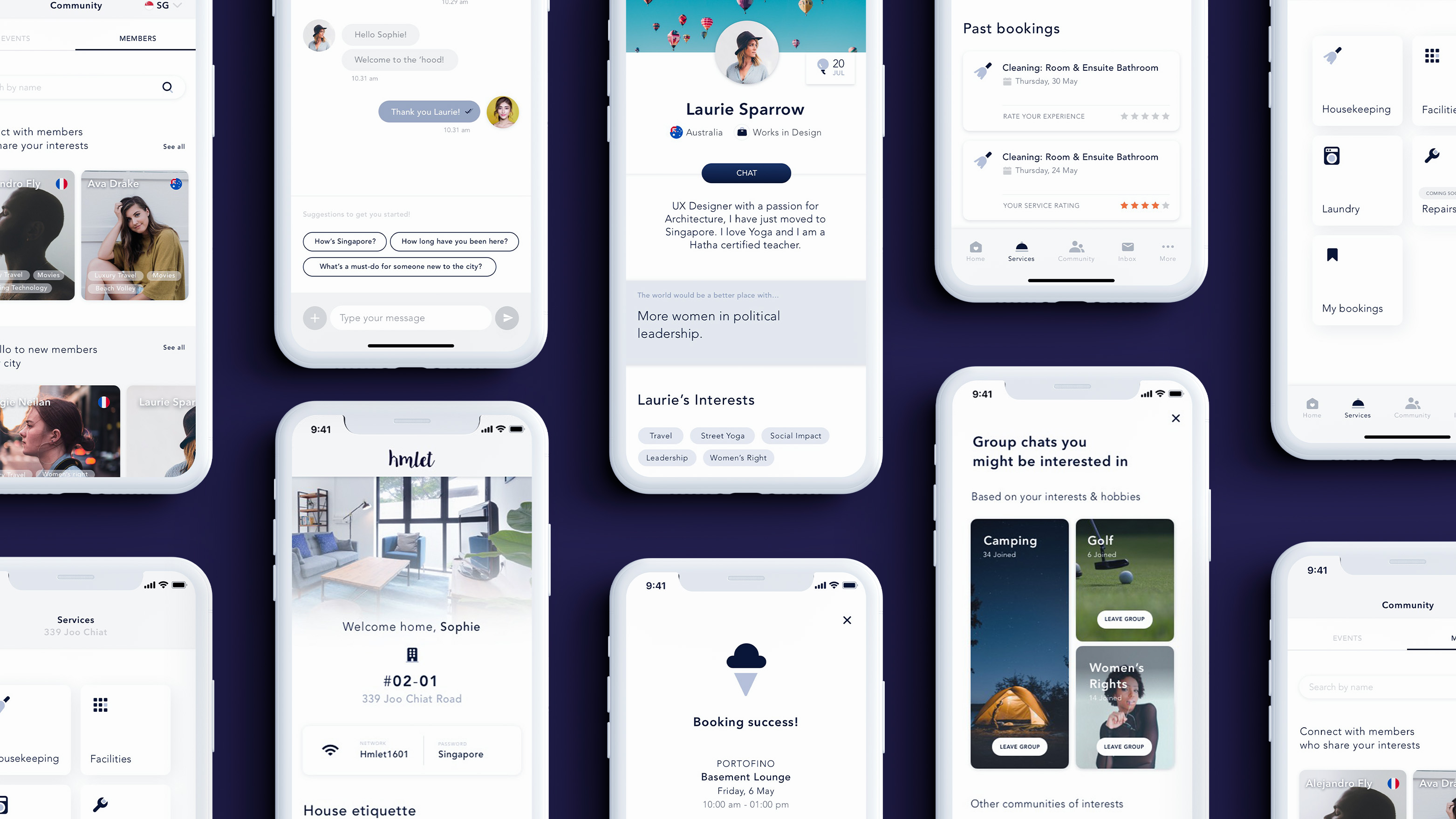
Hmlet is a community-centric, living and lifestyle platform. This is the story of its app, a one-stop application exclusively for Hmlet members. Serving both our members and teams, the app allows Hmlet to customise important moments along members' coliving journeys; helping to integrate, connect and reward. As the first UX designer, our app was my main priority.
My role
UX Researcher - UI Designer - Art DirectorConduct desk research and competitive analysis, users and 3rd parties interviews, design low, mid and hi-fidelity wireframes, define user flows and information architecture, set visual quality standards and establish guidelines for UI team to adhere to, app launch video art direction (second stage).
Team (1st phase)
Vera Li, UX Lead
Nizam Zainal, Visual Designer
Sonia Mao, Content Designer
Eugenia Leo, Prototyping
Zaid Hakak, Engineer
Strategy
Starting from zero
Humble beginnings I joined Hmlet as its first designer in early 2019 and I worked in close contact with the UX Lead shaping the design team roadmap and all b2c products (website & app). There were 40 of us who worked in the company at the time. We were located in a traditional shop house in the heart of Singapore Central Business District. We were passionate. Our brand had a logo, an inconsistent identity, a vague idea of a mission, and a janky mvp of an app and website that left a lot of room for improvement. Alongside working on a brand rejuvination, the business chose to focus on building a member’s app that could engage with our community and provide a sense of connection and utility.
Our Journey
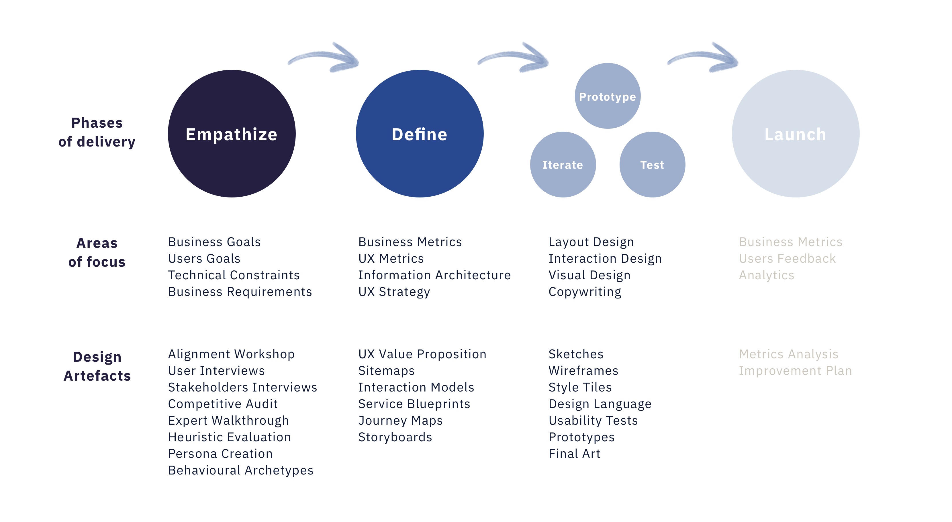
MVP1 Problems The app was created only by developers and at its MVP1 stage. It had a confused information architecture, leading to a low level of usability, a design execution that ignored the principles of consistency and standards in UI design, and it was set up as an informational touchpoint rather than truly enabling ‘self-service’ capabilities. We quickly teamed up with devs and all the relevant stakeholders (business) including the member experience team (the closest function to our members) to empathise with business and users needs.
Business Needs
1. Establish consistent standards of customer service
at the highest level, freeing up the Hmlet team from requests or questions that can be handled by technology.
2. Compile all the data in one place to facilitate collection and analysis for personalisation and cross-selling.
3. Be a new revenue source, supported by the development of new services/3rd party partnerships and integrations.
Members Needs
We compiled all the research findings previously done into decks and folders easy to access. To validate some points of the research we conducted a few more guerrilla customer & stakeholders interviews, desk research, slapped on a handful of sexy product inspirations and pushed go.

Some bits of the Hmlet Research Group chat and guerrilla research on social media.
Problem
How might we create a useful and engaging digital experience to current members and potentially attract new ones?
Useful → Functional aspects of the experience: Services, billing, support, events, time-based content that is relevant to a particular stage of the customer journey. Engaging → Social aspects of the experience: Community, events, social profiles and conversational prompts.

People • Product • Promotion
Strategy
Finding our North Star
Finding our North Star
Where should the members’ app go for the customer?
What is the best possible experience?
We started by consolidating what we knew about customer and/or potential customers by creating three personas and their journeys. At that time Hmlet core focus was on expats members visiting and/or working in Singapore, early to late millenials.
Then, we used a matrix chart to prioritise features in base of their Business Value and User Delight level. We prioritised streamlining business operations by technology (eg. booking a cleaning service, booking a recreational facility) and users needs over wants, but also tried to exceed user’s expectations (onboarding, new profile setup and know my flatmates).

We moved into two directions, both designing new features and implementing the existing ones.
Defining / Designing
Defining / Designing
Issues & Solutions
Review IA
Test IA for improved navigation/findability.
Test IA for improved navigation/findability.
User interface
Use of repeatable, reusable components for scaling up our digital product.
Use of repeatable, reusable components for scaling up our digital product.
Set a tone of voice
Delivery of meaningful, relevant content using accessible language and visual aids.
Delivery of meaningful, relevant content using accessible language and visual aids.
Develop new features
Prioritise features in base of their Business Value and User Delight level and plan deployment within multiple
sprints.
Prioritise features in base of their Business Value and User Delight level and plan deployment within multiple
sprints.

Product Vision via Sitemap
The art and science of organisation,
structuring, and content labeling.
Alignment of our digital product to mental models in the market for an accessible mobile user experience.
structuring, and content labeling.
Alignment of our digital product to mental models in the market for an accessible mobile user experience.
A customer-first perspective, not
product-led.
Think: Where should the mobile app go for the customer?
Think: Where should the mobile app go for the customer?
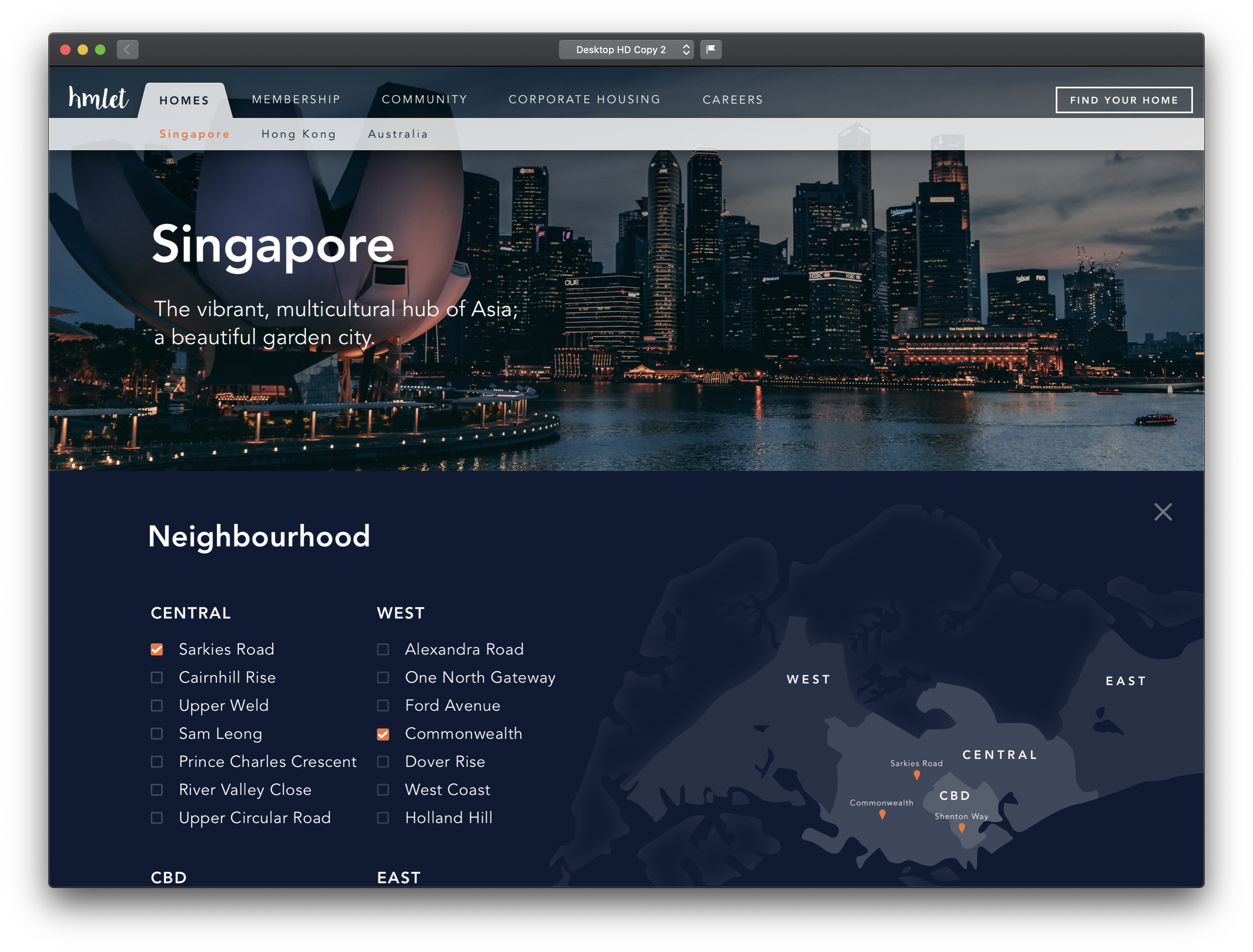

Hmlet Website 2019 - Property listing pages. Fixing inconsistencies and improving the website interface.
This was the starting point of the development of the app UI Library.
This was the starting point of the development of the app UI Library.

“Music is the space
between the notes.”
Claude Debussy
While we were working on the app the marketing team freshly formed was pitching to agencies to find a partner for a brand rejuvination. Considering this, we decided to create a basic but fundamental UI Library, an interim solution to ensure quality and consistency standards while waiting for the new look & feel to be ready. We used all the existing visual assets of the brand (from colours to typography) and optimised it by following material design best practices and rules. To move quickly, we bought a set of icons and a design system that we adapted to our needs. It was revealed to be a smart decision given the fact that most of the components and the icon library are still in use nowaday, well representing the growing portfolio of products and services the company provides these days.


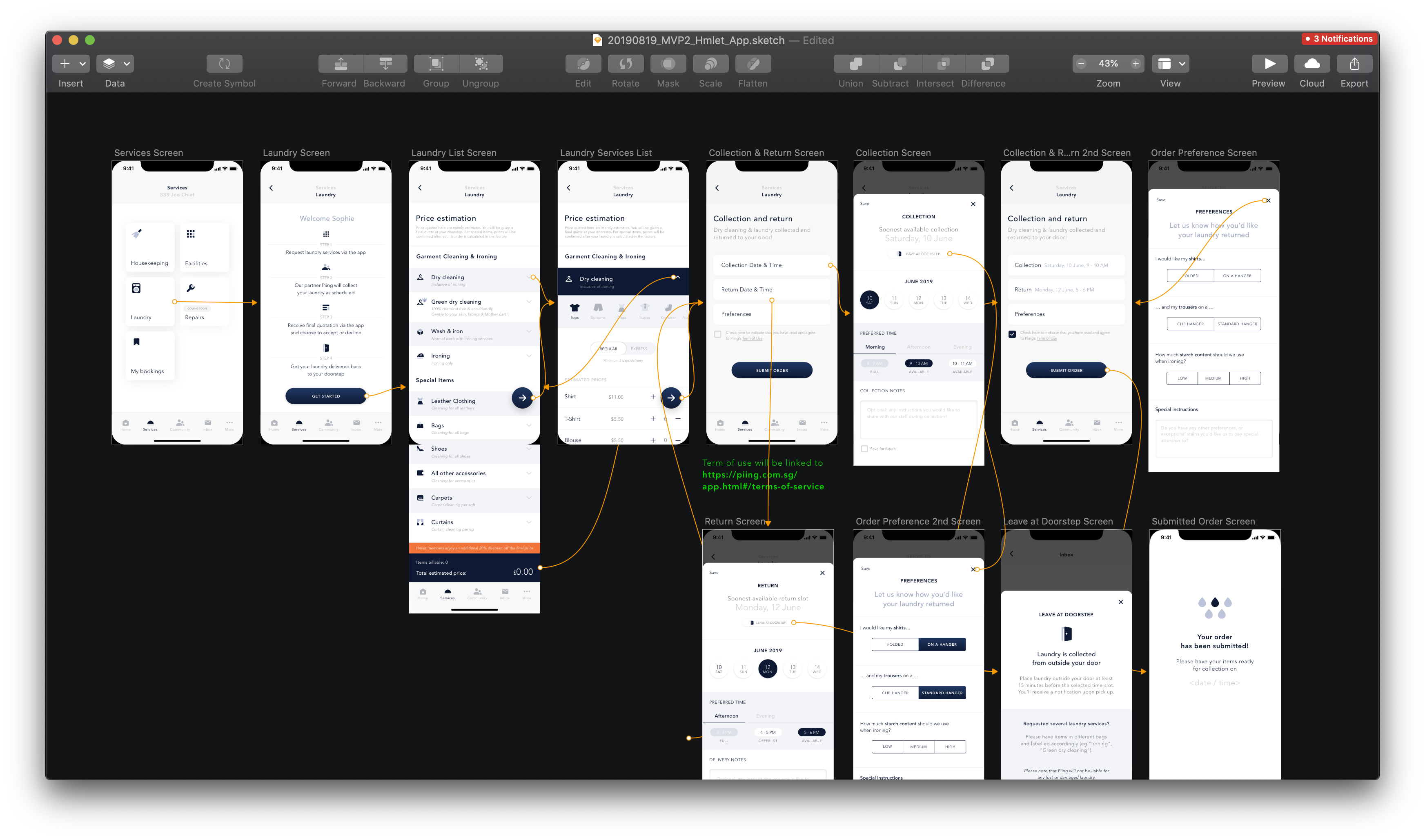
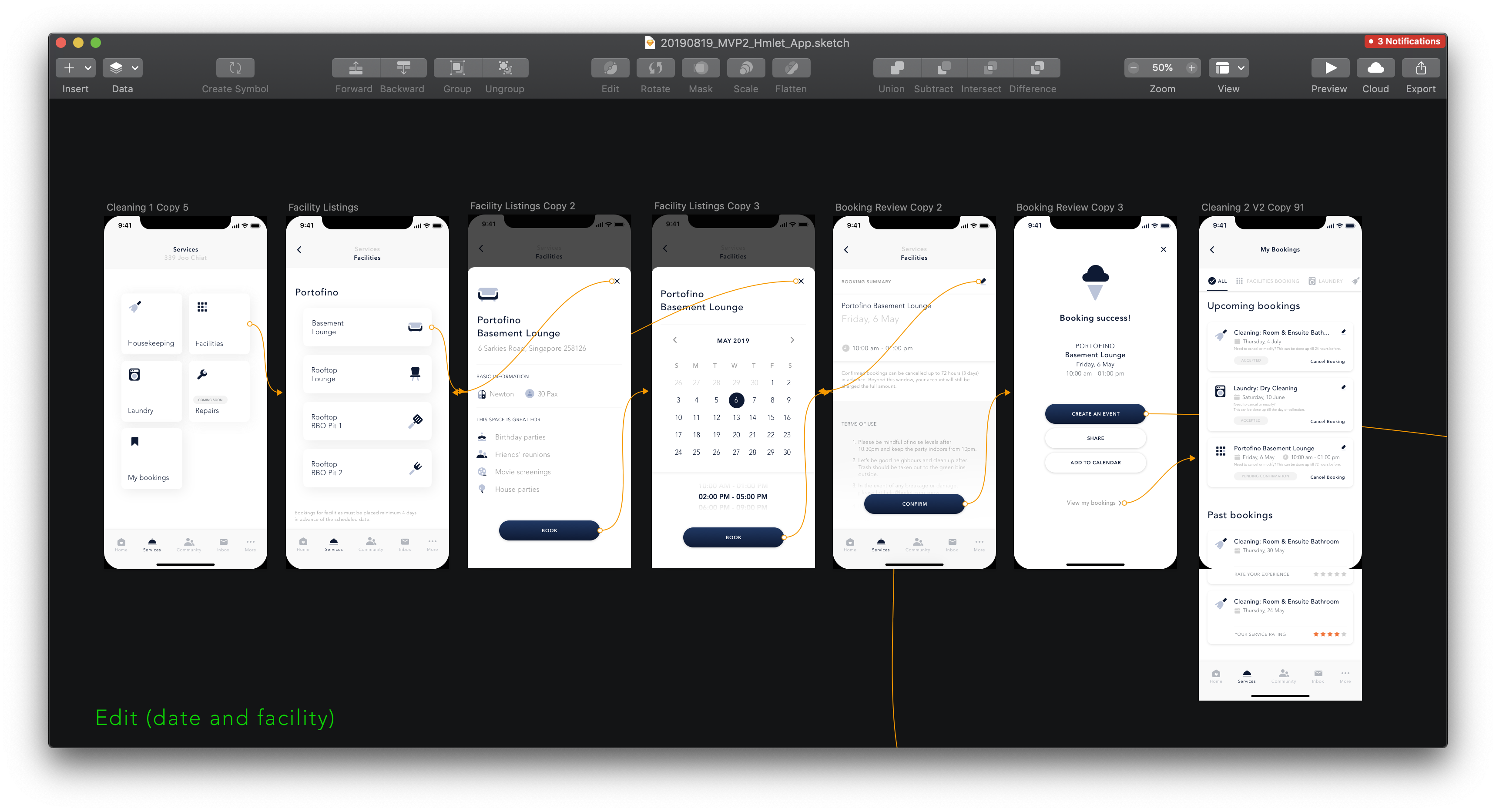
1 Onboarding - Sign up - Sign in. Set up profile - Join interests groups and House etiquette.
2 Know my flatmates - An overview of the community and the possibility to connect via individual chat and grop chat. Create an Event.
3 Housekeeping Booking - First time and recurring booking - Payment system and set up payment method.
4 Book a Laundry Service (third party).
5 Facility Booking.
Throughout the project, we created rapid prototypes to present new features to stakeholders, test the features with our members and iterate, iterate, iterate. Requirements changed and new constraints were uncovered. Early on for example we learned that facilities on newly acquired condos could not be booked if not through the management of each single building. Ulimately we put aside the journey and made sure to include all relevant information in the building section of the app. In the end only some of the journey were implemented and developed. After completion of this phase, the app was kept on maintenance mode until the start of the rebranding effort, in 2020.
Outcome
This was a really exciting and fun project for me to work on as it provides real value, involved a ton of research, and detailed interaction work. However, shifting priorities have delayed the launch of the features. Still, I learned some important takeaways from this project related to product and business processes.
How to adapt to changing requirements
New timelines, resourcing issues, and reprioritization meant the scope of the project was constantly changing. I had to adapt to those changes and still deliver the best design in time with tight deadlines.
Always fight for good UX
Other business teams in Hmlet and business teams in companies in general fail to see the importance of experience design. We really had to fight to educate stakeholders on our value in delivering insight to Hmlet business teams on matters of design, how to best streamline the collaboration process in working with us, pain points of inefficient communication and their misunderstanding of UX.
Choosing what we won’t do
There were many great use cases we could tackle with a rich feature set. However, every single one was costly or unrealistic. We had to determine where the real value was for Hmlet so we did not spread ourselves too thin.
Hmlet App 2.0:
A new phase
In March 2020 along with the roll out of the new Hmlet brand identity the Hmlet App was revamped complitely. Objectives were: Align the look & feel to the new visual identity, conduct research to revisit some of the journeys and develop new services/3rd party partnerships and integrations. As Brand Designer at that time my role was to ensure brand compliance and quality standards, working closely with the UI team on the new Design System (unfortunately, due to a lean team and different shifts in directions, it stopped at its initial phase) and lead the creative effort of the marketing team to promote the app externally and in our community.
Read more about the new app:
> The remote control to your life at Hmlet > New products we built in a pandemic
Read more about the new app:
> The remote control to your life at Hmlet > New products we built in a pandemic
Hmlet App 2.0 Launch Video