Case study
From Co-Living to Living & Lifestyle Platform
Launched in 2016, Hmlet has grown exponentially. From managing shared properties to being the largest co-living community in APAC, extending into serviced apartments. With accelerated growth came its own unique set of challenges, especially for brand consistency. Our teams needed to hustle fast and hard, and this meant that we’ve forgone a clear brand and design direction in favour for fast fire tactical team requirements. Coupling this with acquisitions of other property companies, Hmlet had a variety of inconsistent and different messaging, values and design structures in various formats - CRM, sales lead collateral, event posters, website / app etc.
Ambitious to become the most loved lifestyle and community living brand, Hmlet in collaboration with 72&Sunny Singapore, started the brand rejuvenation effort in late 2019.
Ambitious to become the most loved lifestyle and community living brand, Hmlet in collaboration with 72&Sunny Singapore, started the brand rejuvenation effort in late 2019.
My role
Brand Creative Manager and DesignerBuild Hmlet creative team and mentor junior designers, articulate and flesh out the brand architecture, expand on our brand visual identity, support and drive the re-development of the front end design of website and app interface, create brand and communication playbooks for community, sales, user experience, product teams, lead the roll out of new brand assets across 4 countries and overlook adoption and quality standards.
Team
-
Amy King Pak, Marketing Manager
Fizah Hatman, Assistant Marketing Manager
Yi Lynn Chan, Content Strategist
Hui Hui Ng, Senior Graphic Designer
Phat Nguyen, Video & Photo Editor / Graphic Designer
-
Amy King Pak, Marketing Manager
Fizah Hatman, Assistant Marketing Manager
Yi Lynn Chan, Content Strategist
Hui Hui Ng, Senior Graphic Designer
Phat Nguyen, Video & Photo Editor / Graphic Designer


1 Members at Hmlet St Peters property launch, Sydney.
2 Hmlet Shibuya Shoto property facade, Tokyo.
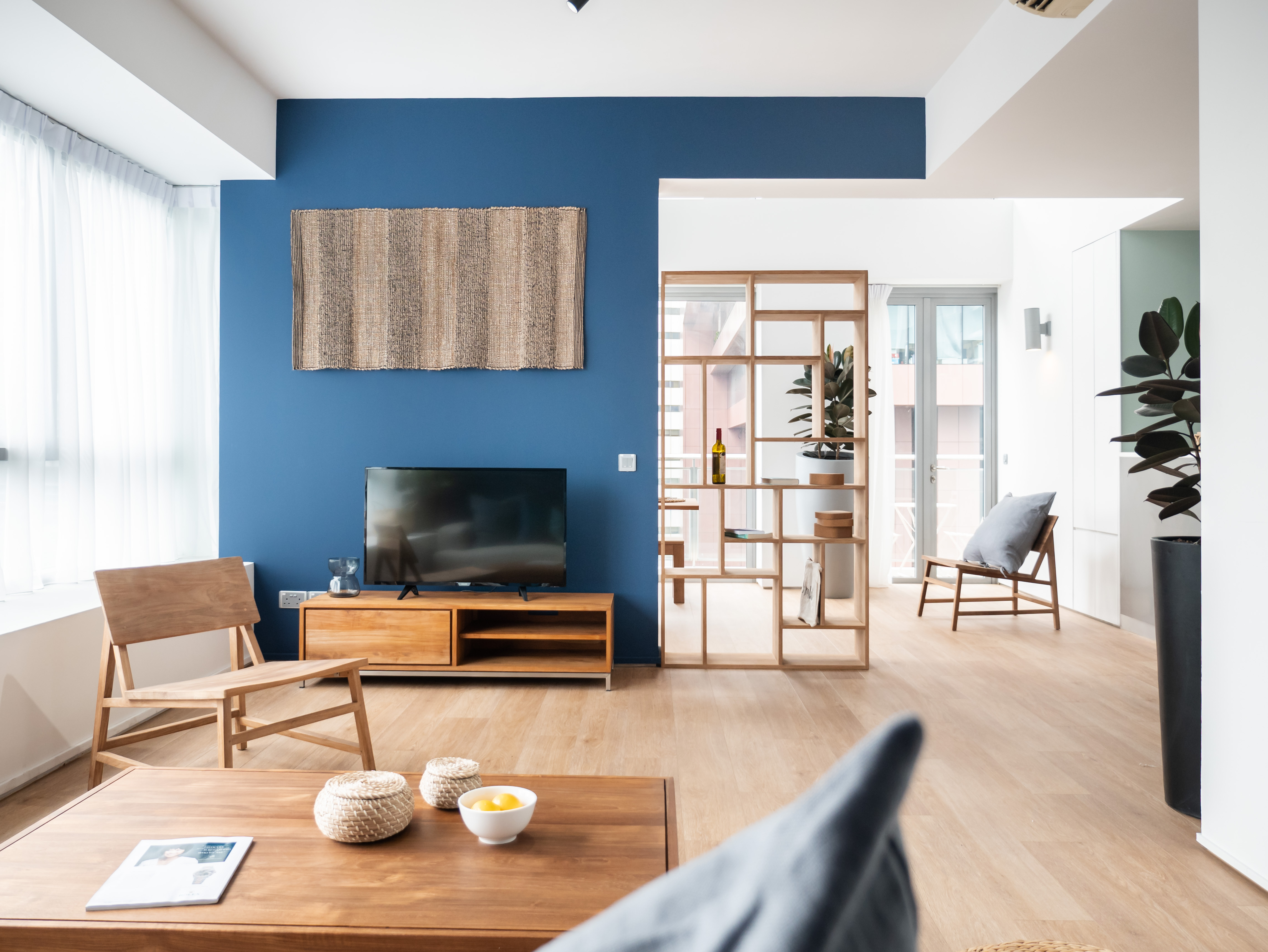
3 Hmlet interiors are characterised by a signature coloured wall.
2 Hmlet Shibuya Shoto property facade, Tokyo.
3 Hmlet interiors are characterised by a signature coloured wall.

“The brand identity of Hmlet draws on its diverse and friendly community to create a visual personality that’s inclusive, modern, empowering and more than a little playful.”
A home far from home. What’s a gal to do when she got an amazing job on the other - or almost - side of the world, busy to settle in a new city, to find a place to stay and some humans to enjoy her spare time with, without having family and friends to support? Or a spot to network or find inspiration and learn about a new city, while she’s living her best life traveling around? These are just a couple of cases. Hmlet is a living & lifestyle platform that offers hassle-free living solutions through curated custom-design spaces and services. It designs and curates co-living or private apartments, take care of all services with all-inclusive billing options that cover cleaning, maintenance and utilities and provide members with a community for people from all walks of life to connect and grow into their best selves.
Designing a new Hmlet. As the internal - and fresh - marketing team in collaboration with 72&Sunny Singapore, we developed a brand identity that draws on its diverse and friendly community to create a visual personality that’s inclusive, empowering, modern and more than a little playful. The project encompasses everything from typography, messaging to environmental graphics, the Hmlet website and Member’s App, branded amenities for the properties, and most of the collaterals for our members and employees.
Designing a new Hmlet. As the internal - and fresh - marketing team in collaboration with 72&Sunny Singapore, we developed a brand identity that draws on its diverse and friendly community to create a visual personality that’s inclusive, empowering, modern and more than a little playful. The project encompasses everything from typography, messaging to environmental graphics, the Hmlet website and Member’s App, branded amenities for the properties, and most of the collaterals for our members and employees.
Hmlet Collaterals Showreel from Hmlet on Vimeo.


1 Hmlet Cantonment Block Party, Singapore.
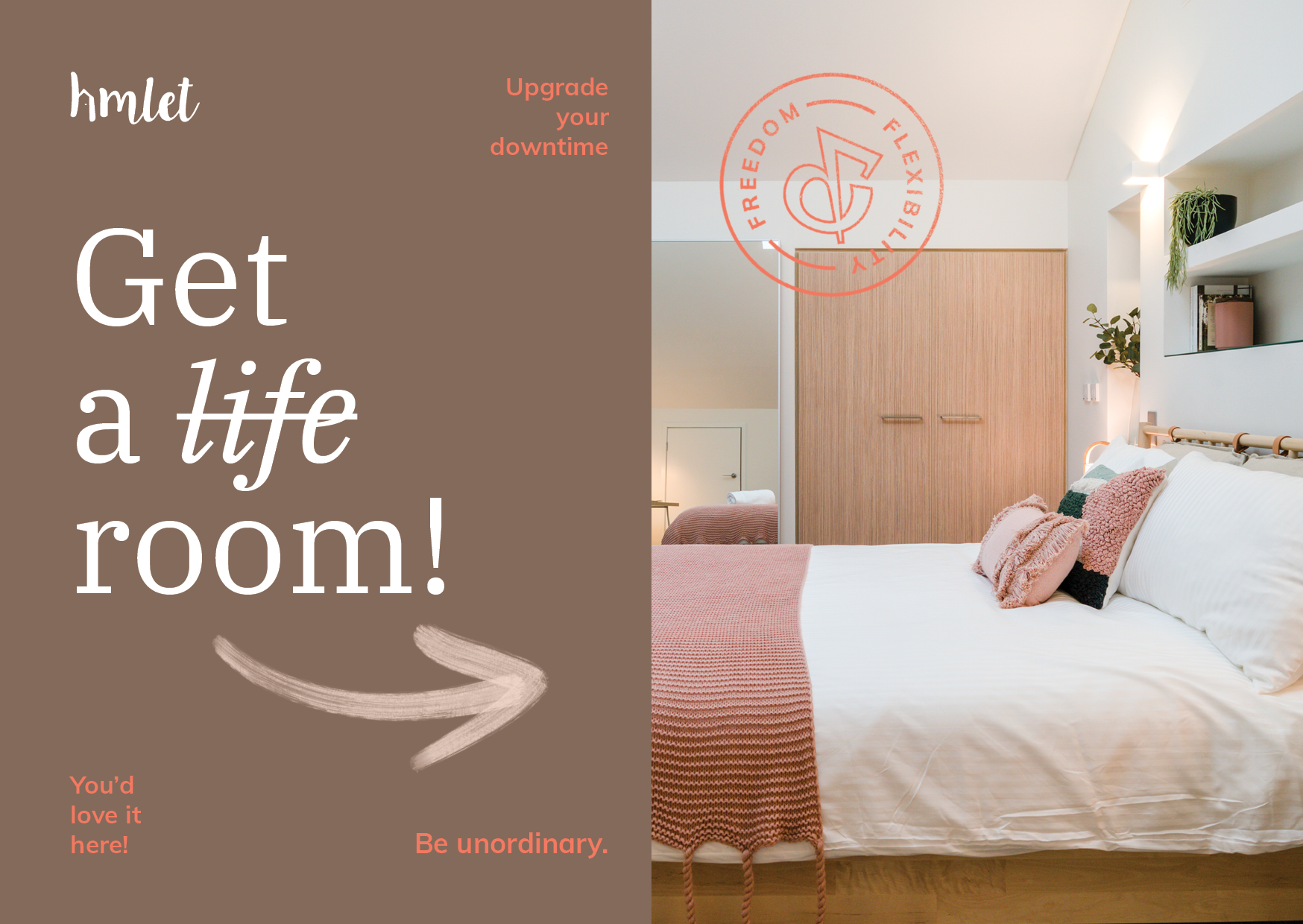
2_3 Postcard and business cards.
“We free people through homes, services and products - enabling our members to have time to live more and do more through our curated contents, programming and community - enabling them to explore and discover what they love, to be unordinary.”
Co-founded by two tech-savvy millennials with an entrepreneurial mind, Yoan Kamalski and Zenos Schmickrath, Hmlet is envisioned as a place that creates a new type of real estate that allows people to match their lifestyle, finances, and their desire to connect with others who may change their lives. Its members are future-forward thinkers from all walks of life from over 50 nationalities.
The team worked closely with Zenos and Yoan to develop a brand that felt authentic to the company’s bold point of view: Changing the way people live. The challenge was creating an identity that would appeal to a diversity of people without pandering or being stereotypical. After months of exploration and hard work, the new and bold Hmlet tagline saw the light: Be unordinary.
With this new call to action we want to invite people to cast off the mundane in favour of questioning the status quo and going off-piste. For some people, being unordinary means stepping away from the norm. For others, it’s about making a difference in the world. “You define what unordinary means to you, and we’ll empower you with the home, lifestyle and environment to achieve it.”
“No matter how you choose to live your life, do it in a way that pushes you out of your comfort zone while leaving little room for regret.”
Hmlet Brand Manifesto. Be unordinary.
Hmlet Product Video
“I wanted a logo that people can recognise, having a door to opportunities and wanted it to be quirky. The pointy “h” was about representing the roof anywhere around the world and the dot being the handle or door to friends and opportunities.”

The Hmlet logo was created in 2015, just before Hmlet launch. It came from Yoan’s vision: “I wanted a logo that people can recognise, having a door to opportunities and wanted it to be quirky. The pointy H was about representing the roof anywhere around the world and the dot being the handle or door to friends and opportunities.”
The identity utilizes a series of visual elements (from brush strokes to stamps and line illustrations) a nod to the eclectic makeup of the membership and its diversity of perspectives and different voices. Moreover, they introduce an element of visual surprise that keeps the identity fresh, unpredictable, and endlessly flexible to multiple contexts and messages.
In tandem with the visual identity, the team worked deeply to develop messaging that captured the community’s quirky spirit and attitude. Like the graphics, the tone of voice personality is inclusive, authentic and modern with a touch of playfulness. The delivery is clean, clear and to the point, with a pinch of wit and unexpectedness.
The core focus of our visual identity, typography plays with both a serif, IBM Plex Serif and a sans-serif, Mulish. Both are Google fonts, that allow flexibility of use given by multiple weights and their availability almost on every platform. IBM Plex Serif is an elegant and crafted typeface used to convey a premium feel. It was designed in IBM to illustrate the unique relationship between mankind and machine, an idea that well fit Hmlet as a prop-tech and community centric company. Mulish, is a clean, contemporary sans serif typeface with a playful personality used to convey a laidback and warm feeling. It was initially drawn in 2011 and since then has been evolving - all based on hundreds of users' feedback.
The colour palette is a pale take on human, natural and premium hues. The main brand colour is navy. The precisely considered secondary colours include mint green, peach, golden mustard, beige and white, each with a set of accents.
Read more: > Meet Hmlet Again


